When chart section is first displayed, is draws a chart that was selection during report creation as initially displayed chart 1.
Chart type can be changed at any moment from the dropdown list 2.
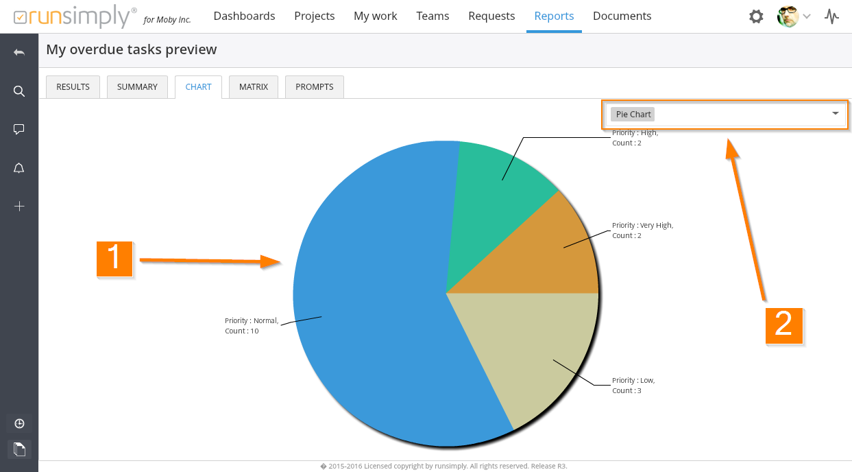
NOTE: Changing chart type in chart section is only temporary. It doesn't modify the report itself. When you run your report again, the chart that will be displayed is the one that you have selected during report creation.
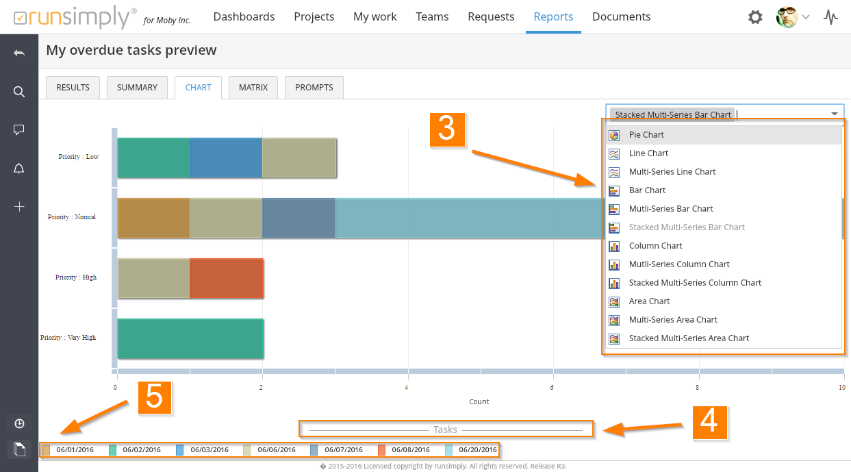
There are many chart types that you can select 3. Some chart types use a single grouping fields to draw it's values, like Pie chart. They create a single series of value groups. For example, if you have 10 tasks and 5 have high priority, 3 have normal and 2 have low, you have 3 different groups when grouped by priority.
On the other hand, some chart types use two groupings to create multiseries value groups, like Stacked Multiseries Bar Chart shown on the image above. This means that grouping is done even within the initial groups so you have groups within groups of data.
NOTE: If you have created a report with a single chart grouping field and while running report in chart section you select a chart type that requires two grouping fields, instead of a chart you will see a message saying that you need two grouping fields in order to draw selected chart.
If you have selected a chart type that requires two grouping fields, additional chart legend will be shown under the chart. The legend consists of title 4 and group values 5. These values are basically values of groups for the first chart grouping field. The title displays the name of field used for this grouping.
Like and share