Setting up chart for the report is quite straightforward. You need to select what type of chart you want to be displayed by default 1.
NOTE: You can view your report using any other available chart once you run your report.
After that a field that the chart will use for it's values needs to be selected 2. By default number of items will be used as a value but you can use any other fields from chart's view that has an aggregate function defined.
For example, you might have a column in your view for Task Status and you want to have aggregate function that counts distinct values of all task statuses in your data. That distict values count can be used in your chart as a value field.
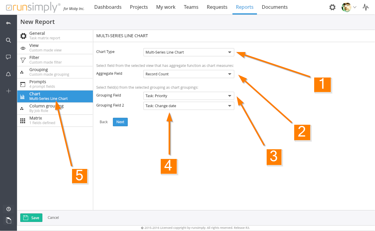
After setting aggregate field for you chart you need to setup grouping fields 3. Most charts require just one grouping field to be selected but some chart types, like Multiseries Line Chart requires two because two groupings are used to draw the chart 4.
Grouping fields you can select are the same grouping fields that are used in your report's grouping.
NOTE: If you select a chart type that doesn't require two groupings, you will be able to select only one grouping, the other one won't be available. If, however, you select a chart type that does require two groupings and later, when you run the report, you select a chart type that doesn't use two groupings, the first one will be used for drawing that chart.
For better overview of report that's being created, under Chart section name you can see the chart type that has been selected for this report 5.
Like and share