Matrix section of running a report enables you to view summary values of your data grouped both vertically and horizontally as a Pivot table.
For example, from matrix view you can get information like 'in second quartal of each year we see increase of high importance risks and in third quartal we see a considerable decrease in problem resolution'.
Pivot table can contain many grouping levels in both rows 1 and columns 3 and can contain many measurement values at the same time 5.
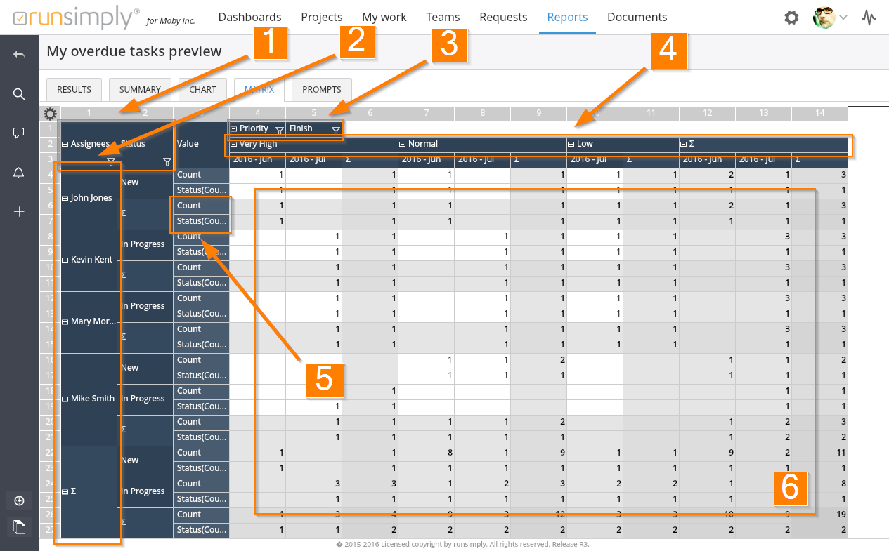
On the image above, you can see there are two levels of groupings for rows: by Assignees and by Status. There are two levels for columns too: by Priority and by Finish date.
For row groupings, values are displayed underneath the it's title 2. For column groupings, values are displayed in header rows in such a way that the first row contains values for the first grouping, second row contains values for the second grouping and so on 4.
Each group of values can contain summary values. Whether summary will be displayed depends on settings set up during report's creation.
Pivot table values 6 are displayed as a cross section of row and column groupings. Values are displayed only if they exist i.e. value of zero is not displayed and the cell is left empty.
If the pivot table size exceeds that of the screen size, you can pan the cell area in all directions using your mouse. Both the row and column headers will stay fixed on screen so you can always see what data you are looking at.
Cells in pivot table are colored differently if they are used to display summary values. The color depends on the number of summary groups that a particular cell is displaying value for. The bigger the number of summary groups, the darker the cell. Bottom right cells are in cross section of all summaries and they are the darkest.
NOTE: Depending on the amount of data and complexity of your report, creating pivot table can take some time. If you are making a pivot table that you want to show in your dashboard, try to avoid complex tables with lots of data. On the other hand, if you need a complex pivot table with lots of data, you might be better off running such a report from reports section.
Customizing displayed values
When number of values in row and column headers of pivot table is big and it's hard to see the information you need for particular values, you can use header filtering. Header filtering enables you to select exactly which groups of data you want to see.
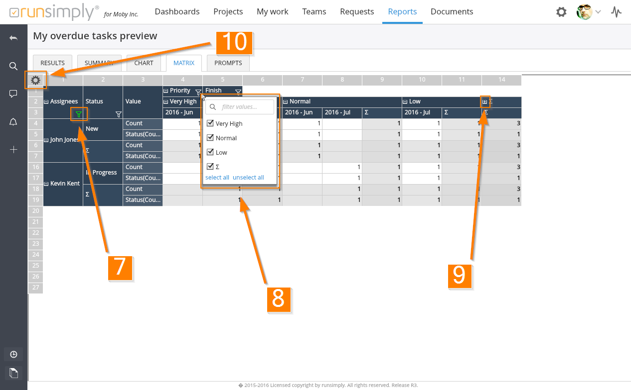
By pressing the filtering icon 7 for a particular grouping, a popup displaying it's values is shown 8. Here you can select exact values you want this grouping to show. You can also use filter on the top to find the values you need faster. On the bottom of this popup you can find two buttons for easier selection: select all and unselect all.
When you activate header filtering by selecting some values but not all, filtering icon's color changes to green in order to notify you that some values are not displayed.
You can also unselect all values for a particular grouping. In that case filtering icon's color will turn red.
If you don't want to hide entire grouping value and it's data, you can also simplify it by collapsing certain groups of data 9. When collapsed, collapse/expand icon will change to notify you that a group is collapsed. You can always expand that group by pressing the icon again.
You can also show/hide and collapse/expand grouping values on entire pivot table. To access this functionality press the matrix settings button on the top left corner 10 which will open options popup 11.
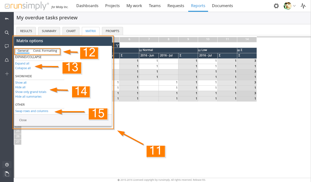
Pivot options popup has two sections: General and Conditional formatting 12. General section gives access to show/hide and collapse/expand functionality.
In order to expand or collapse all groups in your pivot table at once, you can use Expand all and Collapse all buttons 13.
To show all values in case some are already hidden or to hide all and then manually show only some, or to show only grand totals or to hide all summaries, use buttons under Show/Hide title 14.
You can swap rows and columns of your pivot table at any moment. This will reload and redraw the entire pivot table 15.
NOTE: Changing anything about the pivot table during report's execution is only temporary and it will not change your report. When you start your report again, everything will be shown as it was initially set up in your report.
Conditional formatting of values
In order to emphasize certain values in your pivot table, you can use conditional formatting. This can help you segragate your data visually.
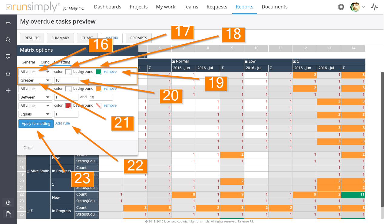
To access conditional formatting, press the matrix options button on top left corner 10. In the matrix options popup go to conditional formatting section 12.
To add a new rule press the Add rule button 22. You can add as many rules as you want.
Each rule defines how the table cell that passes rule's condition should be colored.
For each rule you can choose which pivot measure values you want to format 16. You can select all measures at once or a particular measure.
You can set text color of a cell 17 and you can define cell's background color too 18.
You can delete a rule by pressing the remove button 19.
Conditions for a rule consist of an operator 21 and a value 20. Your rule can say: I want all cells with values greater then 10 to have their background color green and their text color white.
When you are done creating your rules, apply them by pressing Apply formatting button 23. They will be applied across the pivot table cells.
NOTE: You can apply formatting even before you finish creating the rules. Matrix options popup will not be closed when you press the Apply formatting button. This enables you to check what your pivot table will look like even while you are still creating the rules.
Like and share